

David Carson - Designer Study + Emulation (2021)
David Carson is a legendary graphic designer and artist who revolutionized contemporary graphic design. His work shattered expectations around stiff layouts or sticking strictly to the serious and "rules". His deskilling for companies as large as American Airlines, or as punk as Raygun magazine, helped inspire designers around the world to take chances and embrace the unusual.
This project was made for my Graphic Design I class at Oakland University. I chose Carson as the designer I wanted to make my work in honor of because I also choose to view design in a similar, experimental way.
When approaching my digital piece, I made sure to keep in mind how Carson approaches the portrayal of his images and their integration with the artistic elements and text. He often likes to make the headline dynamic and eye-catching, and his work has a clear hierarchy (which aids in the legibility of his abstract work). I also had the chance to make more experimental decisions because he often pursues more creative approaches to graphic design. This can be seen in the heavily edited composite portrait I first created in Photoshop, then integrated into my Illustrator design through abstract and fluid brush strokes.
The color scheme, Pantone yellow and solid black, shows a dynamic contrast that exudes both his energy and liveliness in design, but also the California lightness and
experimentality that he often draws inspiration from. I also chose to arrange the body text more organically and without paying much attention to any grids or guidelines, as he may have done in his earlier works for Raygun. The body text encapsulates his essence in a quote by the AIGA. Emulations of his own pieces can be noted also by the upside-down orientation of his portrait. Carson designed a cover for Raygun in February, 1993, where he oriented the cover star upside-down because the music artist hated the press and was very grunge in the sense that he wanted to pursue his passion freely without the pressure of publicity. Seeing this, I felt that David Carson also focused more on his passion for design than conforming to the stricter side of design.
experimentality that he often draws inspiration from. I also chose to arrange the body text more organically and without paying much attention to any grids or guidelines, as he may have done in his earlier works for Raygun. The body text encapsulates his essence in a quote by the AIGA. Emulations of his own pieces can be noted also by the upside-down orientation of his portrait. Carson designed a cover for Raygun in February, 1993, where he oriented the cover star upside-down because the music artist hated the press and was very grunge in the sense that he wanted to pursue his passion freely without the pressure of publicity. Seeing this, I felt that David Carson also focused more on his passion for design than conforming to the stricter side of design.
I also chose to emulate the abstract arrangements of type characters in his work for the Channel Islands National Park, where he separates characters and arranges them in a scattered form around free-flowing brush strokes, like I did with the title “Carson”. His “Why Not” attitude (also the subheading in my piece) makes it clear that the ideas he brings to the field of graphic design are exciting, organic, energetic, and avant-garde in the sense that he challenges certain rules while still maintaining clear legibility and hierarchy.

Final Composition - Created in Adobe Illustrator and Photoshop.
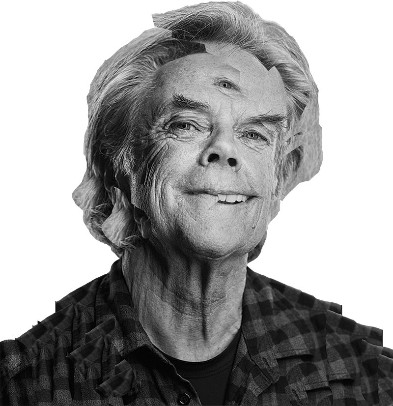
A closer look at the photo manipulation of Carson. Image taken by Norman Posselt.
That's All - Stay Groovy!


